Executive Dashboards for a Frozen Food Manufacturer
Project Description
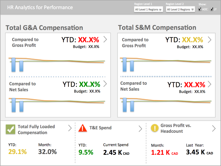
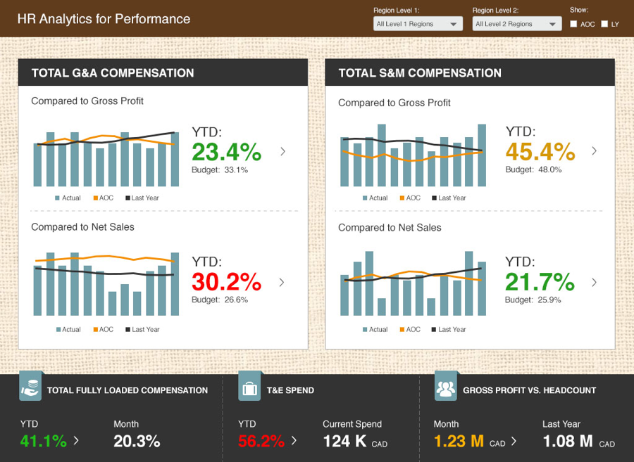
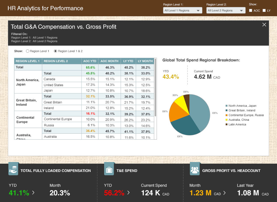
A multi-national manufacturer of frozen foods engaged Teradata to assist in the design and development of a MicroStrategy dashboard that would allow the CEO and his global directors to compare employee compensation spend to net sales and gross profit.
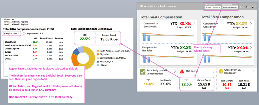
The client requested one dashboard that could serve both the CEO and his direct reports, could be filtered to three regional levels, and could display monetary values in a user’s local currency.
My Role
My role was to perform UX/UI tasks to design the front-end dashboard. What I did:
- Lead onsite interviews and sketching sessions with the client’s users and stakeholders
- Gathered requirements for the dashboard and documented them for the development team
- Designed a series of low-fidelity prototypes in Adobe XD
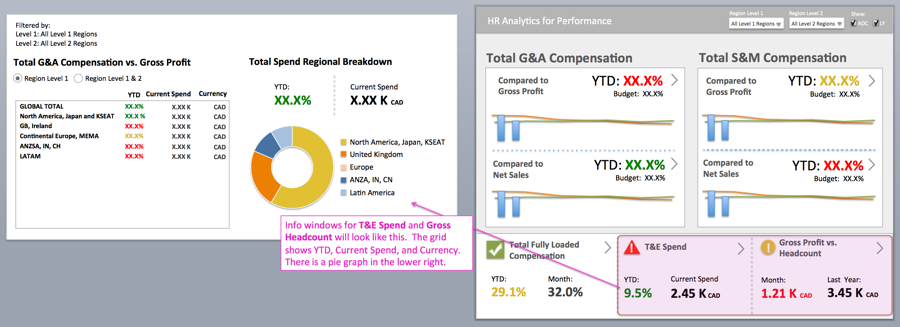
- Created the high-fidelity final mockups that were sent to development
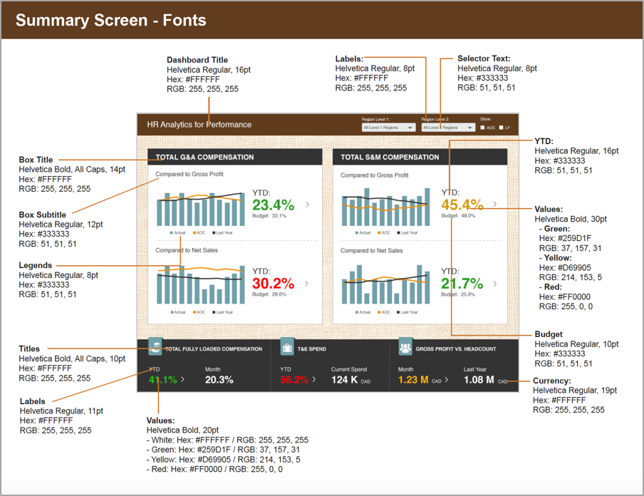
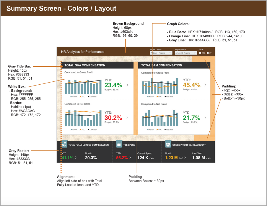
- Produced a style guide for the developers and performed design oversight during the QA process
Tools Used
- Adobe Photoshop and Illustrator
- Adobe XD
- InDesign
- PowerPoint
- Whiteboard
The Process
Teradata built a team of onshore and offshore resources consisting of a project manager, data architects, MicroStrategy developers, and a dashboard designer to complete the project on a very strict timeline and budget.
I had three weeks to complete my tasks, from requirement gathering to final designs.
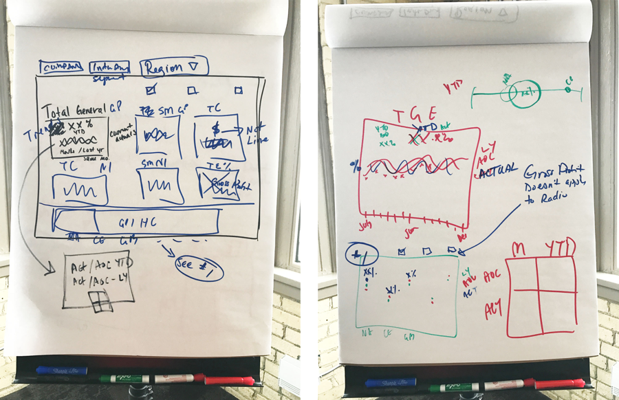
The stakeholders for the project were located in Europe and we knew they had very limited availability. To maximize our time the entire team met at the client’s location in the United States to kick-off the project, gather requirements, discuss data readiness, and hold sketching sessions with the client’s stakeholders.
In advance of our working sessions I created a presentation to jumpstart the conversation and get the client’s creative juices flowing. The presentation showed how MicroStrategy dashboards work, a few very rough wireframes based on the client’s metrics, and some final mockups from dashboards I’d designed in the past.
The stakeholders were very engaged during the working sessions, and we took turns sketching ideas. I came away from the sessions with a solid understanding of how I could wireframe the dashboard.
The Challenges
Because the stakeholders had demanding schedules it was sometimes a challenge to get feedback on the designs quickly. The wireframes were starting to take more time than expected, and it became clear that I would have one week to create the high-fidelity mockups.
The Outcome
The stakeholders were pleased with my initial high-fidelity designs and the attention to detail during the wireframe process meant high-fidelity mockups went through only one round of modifications.
The design project was completed on time and on budget. I was invited to participated in two subsequent projects by the same client.
Feedback from Client
“I wanted to send you a note and thank you for your contribution to this project. I think you did an outstanding job in understanding the requirements from our business and turning those into a great product. Your interactions with the team showed your professionalism and a good customer service approach. You have been a pleasure to work with.”
What I Learned
Having rough wireframes going into the initial meeting can be helpful especially if the clients are new to the design process. The visuals give clients something to respond to, and allow you to start gathering feedback quickly.
Group sketching sessions with focused stakeholders is very valuable, and gives the project a strong start.

